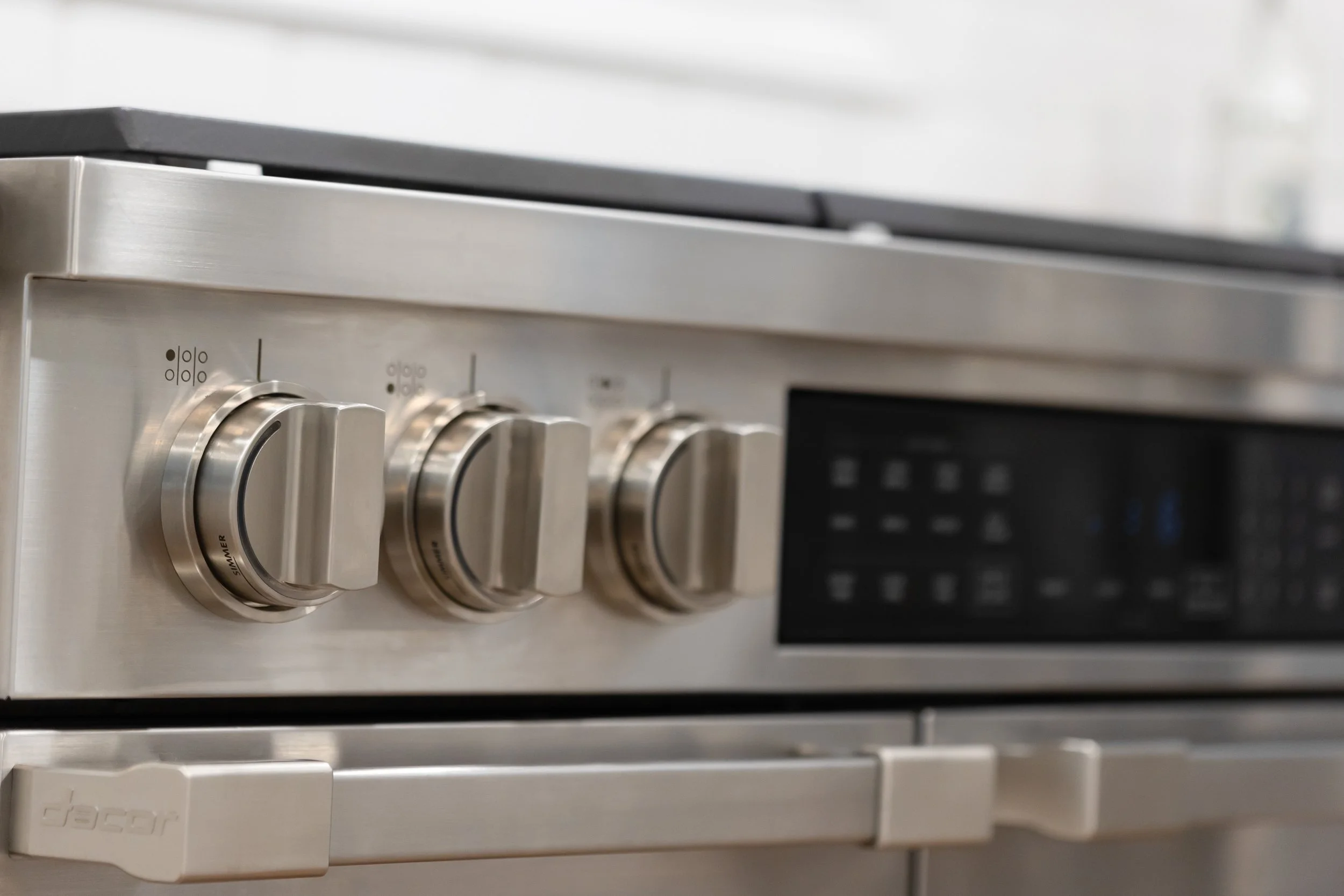
Accessibility and Appliances: Not Always so User-Friendly
Recently, I was in a home of a family member using a new magnetic induction cooktop. They were frustrated at not understanding how to use the controls for the unit. The situation was further complicated by the faint dark grey colors on the controls against the black surface.
I have found that the same issue exists in many microwave ovens and laundry products today; people with restricted vision and seniors are having trouble seeing and working with these types of controls. As much as products are trying to encourage Universal Design elements, these products fail miserably. I love the clean look and sleekness of these products as much as anyone, yet we must remember to make them user-friendly as well. Product designers are missing the mark on these types of applications. Simple backlighting of controls will help. Getting feedback from seniors and folks with restrictions will help. Using the resources available and focusing on the end-user experience will help. We must make our products accessible for all people, as well as pretty.

